Thursday, 23 December 2010
Last Post In Time For Christmas
Of course with my Mac out of action I can't do any artwork, which scuppers my plans for world graphic design domination somewhat. So please accept this Olde Skool scribble as my little Christmas card and thank you for following me this year. Click on it to see it in all its glory.
If you want to check over at my Electric Scrapbook in the next few days I'll post you up some nice goodies to see you into the New Year.
However you're spending the holidays, have a great time, don't abuse your liver too much and try not to get into too many family squabbles.
Thursday, 7 October 2010
Congratulations, It's a Blog!
Not literally of course, that would be rather painful.
It's called Val's Electric Scrapbook and it's going to be a place where I keep all the best things I find scattered about the Internet. So that could be art, design, photos, adverts, illusions, videos or absolutely anything.
There'll be stuff from people I admire, things that have influenced me... oh who am I trying to kid? Most of it will end up being silly and puerile.
The 2 blogs will always be linked together and if you follow me on Twitter or Facebook you'll be the first to know (after me) when either of them gets updated.
So I hope you'll join me over there for some fun. If you need any more enticement, Issue 1 comes with this free cut-out-and-keep Freaky Staring Dragon!
What are you waiting for? Click me! Click me now!
Monday, 4 October 2010
September Round-Up
I've been busy in my Zazzle shop making sure it's ready with lots of exciting goodies for you to treat your loved ones to. I've added 2 new flags to my collection: Ireland comes in a choice of 4 background colours and Japan comes in a choice of 3.
As always, the flags are available to purchase on keychains and a selection of different sized badges and fridge magnets. They look stylish on their own or even better displayed as a full set.
For my second Zazzle range, we move from flags to whole islands - in fact the most fantastical islands you've no doubt ever seen. Prepare to be blown away by the incredible world of the Font Islands!
Using a combination of Photoshop and the 3D landscape generating software Bryce, the Font Islands were created by me in 2002 as an experiment to find a highly original style I could use on monogrammed gifts. The range features 26 of the best known fonts, each one individually selected to show off the elegance of the chosen letter. Textures were generated for the islands and water to conjure up a mixture of lifelike and surreal land masses.
Saturday, 14 August 2010
Zazzle Flags, Part 2
Today I'm pleased to launch two more flag sets onto my Zazzle shop - the Rainbow Nation flag of South Africa and the much-loved home of culture and history, Italy.

As before, these designs are available on keychains and a range of badges and magnets in a choice of sizes.
Click here to visit my shop or use the Zazzle panel on the left of this page to look at today's recommendations.
More flags will be coming soon, subscribe to this blog or join me on Twitter or Facebook to keep bang up to date.
Wednesday, 26 May 2010
The Grand Opening

Monday, 17 May 2010
The Big Rethink
Wow, has it really been 2 months? Long time no see. How you doing? Did you miss me? Probably not. Oh well.
So what have I been up to all this time that's meant I've been neglecting the blog? Well a couple of things sprung up to confront me around the end of March. One good, one bad, both connected and both requiring me to have a big rethink about my life and career. A few weeks down the line, now's a good time to reflect, regroup and take things in a new direction.
First the bad thing. I passed that milestone of being unemployed for 12 months. I am now officially dole scum. In the UK, at 12 months the Jobcentre washes their hands of you and passes you on to a private initiative called A4E. Going freelance seems the best option for me to get any work but, annoyingly, I am now no longer eligible for the government's business start up benefit. You can only get this if you've been unemployed between 6 and 12 months, providing it's a full moon on a leap day and your mother's mother has a living conjoined twin named Grizandella.
Okay, I made some of that up but it really is very restrictive. You'd think that the government would do all they can to encourage people to set up their own businesses, no matter whether they've been unemployed 2 days or 2 years. Yes, new Prime Minister David Cameron, I'm looking at you to sort this out.
Instead I'm shunted off once or twice a week to a rundown office block 2 doors away from a commercial gallery whose window taunts me with £400 prints from my favourite artist. Yeah, world, why don't you just kick me in the face while I'm down?
What amazingly useful stuff do they have me doing there? Er... nothing I can't do better at home, frankly. Sure, there's a need for somewhere like this to help people who lack skills in applying for jobs, writing CVs and letters, learning how to conduct themselves in an interview and so on. But for the vast majority of people, it's just "there's the computers, sit there and look at the job sites for an hour". It's not help, it's having an eye kept on you.
If you're still unemployed after 13 weeks with them (which for me would fall at the end of June or early July, not exactly sure offhand) there's the compulsory 4 weeks' work experience to do, which even my personal advisor has told me would be a total waste of my time. So basically there's big pressure on me to get some work and get it soon.

The good thing that happened recently could actually be a way out of this mess and a big step up the ladder to achieving my potential. Thanks to good old Twitter I heard about something that was due to start in early April called the Zero 2 Illo Twelve Week Challenge, set up by Jonathan Woodward, himself an aspiring illustrator, and his wife Lea who is offering her business expertise. This is a way for those of us with the same dream to gang together and support each other as we work through a set of weekly tasks to prepare us to go into business as published illustrators.
This scheme sounded perfect for me because what I'm lacking here at home is structure, support and understanding. The family want to see cash on the table, not pie in the sky dreams about selling artwork.
So far I've completed the 3 weeks it took to analyse our business idea. I've narrowed down the sector I want to target as being the greetings card industry, with a passive income on the side from selling my own designs, such as the Café Press shops I already have.
Unfortunately, though, I've managed to fall behind everyone else. Just as they're finishing off their portfolio pieces (the next section of the challenge), I'm just starting mine. So there lies the next part of the Big Rethink. For me, this isn't going to be the 12 Week Challenge, it's going to be the However Many Weeks It Takes Challenge. I won't feel comfortable being rushed into making something I'm not totally happy with. I've got 3 ideas to keep me going but, right now, the Inspiration Fairy's not whacking me over the head very hard with her magic wand.
As someone whose mental health isn't 100% either, it's not a good idea for me to take on unnecessary stress. That DOESN'T mean I can't hit important deadlines though! Below you can see my contribution to Amelia's Magazine, a topical blog which often puts out a call for illustrations (it's worth following her on Twitter if you're interested in taking on her challenges). For this election night illustration I wasn't even able to start it until 10.00 pm when the exit polls revealed a likely hung parliament. Then I worked late into the night, grabbed a couple of hours' sleep and finished it the next morning, in good time to be published in her blog.

How to Solve a Hung Parliament
So, as far as the 12 Week Challenge is concerned, I'm still dedicated to it and working my way through it as best I can. I can benefit from it if I complete it, but I won't get penalised if I don't, unlike my jobsearch legal obligations. When A4E call me in for my fortnightly reviews, they can understand "proper" business concepts like writing a business plan. They wouldn't be so understanding about something less tangible, like designing new artwork. So here I have to divert off the Challenge and move onto one of its future tasks, setting up a new portfolio.
I've already posted links to my profiles on DeviantArt and Artylizer (okay, re-adding the links there so there's no excuse for you to miss them!) These are good to get an overview of what I do but I really need something more businesslike. Unfortunately setting up my own website is out of the question right now (unless someone knows an awesome service that's totally free and doesn't just look like a blog). I've found a couple of sites that offer a professional looking portfolio so I'll make my final choice from those in the next few days to host about 10-20 of my very best pieces.
The plan then (which is where I can keep the A4E jobsearch people happy) is to Email local printers and small design agencies with the link. I'll be marketing myself as offering a specialist service that can take on more complicated illustration-based jobs than they could handle themselves. I've known designers in the past who've made that sort of relationship work and I think this is the most realistic way for me to get my feet back into the design world. If I can sweet-talk the printers with promises of slipping them some work, I think I could build up a decent sized address list quite easily.
In between all that, I've been designing more products and working on a new online store. It's almost ready to launch so watch this space! I'm also planning a spin-off for this blog so I can keep this one mostly for my work and have somewhere else I can use to have some fun.
Thanks to the new subscribers I've picked up recently, mostly from the 12 Week Challenge by the looks of it. I've kept you all waiting long enough for new stuff, now it's onwards and upwards to world domination.
Or at least not being dole scum any more.
Wednesday, 17 March 2010
A Post That's About Time
When I've been creating my Café Press shops, the software works by automatically adding a default image to all the products. That saves a lot of work, rather than having to do everything manually, but it leaves a little something missing when it comes to the clocks. Namely numbers!
A lot of people actually like minimalist clocks and it certainly hasn't stopped me selling any. Nevertheless I've decided to make them more usable and create some special clock designs for each store (except the Christmas images which will be added in the autumn).
Café Press have a free clock template to download, which allowed me to get the size and number positions spot on. I looked at how best to showcase each image on a clock and took every one as a different challenge rather than apply a "one design fits all" approach. How should the image be positioned? What font would complement it? Would it need a new background?
The apple, being the most solid design, benefits from being large and in the centre. A strong font in matching red makes this a bright, fresh clock that would look great in a kitchen.

I contemplated having the beachball large and centred too, but I also liked how the stripes framed the chosen font, so that's the look I went for here.

All the animals worked best just on one half of the clock, rather than being skewered by the hands! I chose a font with a lot of character to show off my cheeky cat.

For the dog I decided to have a bit of fun and created Roman numerals out of bones!

The elephant is accompanied by a font that matches its shape and colour.

A similar approach for the giraffe, with a font evocative of tall African trees.

My two aquatic animals called for an underwater theme. The goldfish has a lively, wavy, bubbly background.

The octopus gets a graduated dark blue to reflect its deep sea home, with a curly font to match its tentacles.

Hundreds of hearts come together for this big romantic explosion.

Each clock comes in three diameters, a 10" Wall Clock at £10.50*, a 14" Modern Wall Clock (£31.50) and a 17" Large Wall Clock (£28.50). The Modern Wall Clock has an aluminium body and glass cover, the others are edged in black plastic.
To see the clocks on the Café Press site, click on the design you like using the buttons on the left hand side of this page, then go down to the Home & Office section.
(*Prices are set in US$ and converted to other currencies, which may fluctuate due to the daily exchange rate.)
Sunday, 7 March 2010
The Sunday Head****
Some innocent-looking photos of buildings for you today - a house, a café and a shop. Of course, there's more to them than meets the eye and if you click each photo you'll find out what the twist is.


The story behind the delicatessen strikes a chord with me because I make no secret of the fact I'm out of work and struggling. I live just outside Wolverhampton, which was recently named as one of the worst cities in Britain for boarded-up shops.
In some places round the country, however, councils, arts organisations, entrepreneurs and the unemployed have been joining forces to bring empty shops back to life, if only on a temporary basis.
Empty retail units have been turned into community galleries, youth art centres, shops and workspaces. This has allowed people to put their creative skills to good use, start up businesses and generally make their High Street a more attractive place.
This has the knock-on effect of deterring crime and vandalism, giving hope to local people who are jobless and promoting the town centre as somewhere vibrant, willing to tackle its problems and worth investing in.
I've never been interested in retail before but I would love to get involved in a project that could give me the chance to get myself back on my feet and also work like a support network where a group of us could create something together, make a living and get that all-important confidence boost.
If you would like to find out more about the Empty Shops Network, this is a good place to start.
Saturday, 6 March 2010
And The Oscar Goes To...
It's been a landmark year for animation, with 3D becoming the norm and the largely-animated Avatar one of the favourites for the Best Movie Academy Award.
In the category of Best Animated Feature Film, most of them have been massive hits and need no introduction from me. Walt Disney have two nominations, the massively-successful Up and the recently-released The Princess And The Frog, with its return to classic 2D animation and Disney's first black princess.
Coraline and Fantastic Mr Fox have also been big box office draws aimed at the kids over the year. The fifth nominee, however, is one you've probably not heard of.
The Secret Of Kells is an Irish/French/Belgian co-production which has had virtually no release outside of these countries. It's a story inspired by the Book of Kells, the famous illuminated manuscript of the four Gospels which is considered as Ireland's national treasure.
The film is set in the 9th century and is the story of 12 year old Brendan who lives with his stern uncle, Abbot Cellach, then becomes the apprentice of the inspirational illuminator Brother Aidan. Monks, Vikings, fairies, religion, art and folklore combine into a warm, rich fantasy. Its visual style borrows heavily from the Celtic art that inspired it, making The Secret Of Kells a refreshing alternative to its big budget, high profile Oscar rivals.
Sit back and enjoy a selection of clips.
Best Animated Short Film
There are very few opportunities to see short animations on TV or the big screen but, thanks to the wonders of YouTube, here are 4 of this year's 5 nominees in full, plus a special treat for fans of Wallace and Gromit.
French Roast
Fabrice O. Joubert
A Pumpkin Factory/Bibo Films Production
Some beautiful characters star in this hilarious French comedy of errors.
Granny O'Grimm's Sleeping Beauty
Nicky Phelan and Darragh O'Connell
A Brown Bag Films Production
2D and 3D animation mix as the bitter and twisted Granny O'Grimm tells the classic bedtime story.
The Lady And The Reaper
Javier Recio Gracia
A Kandor Graphics and Green Moon Production
It's Death versus Doctor Dishy in this bizarre, inventive fight for an old lady's life.
Logorama
Nicolas Schmerkin
An Autour de Minuit Production
Thousands of corporate logos are used to create this amazingly original comment on American society. Contains bad language and violence against junk food!
Logorama from Marc Altshuler - Human Music on Vimeo.
A Matter of Loaf And Death
Nick Park
An Aardman Animations Production
Britain's favourite Claymation inventor and his long-suffering hound do battle with the murderous Piella Bakewell.
Here's an exclusive 20 minute making-of feature.
The Oscars will be presented at the Academy Awards ceremony this Sunday, 7th March 2010.
Sunday, 28 February 2010
The Sunday Head****
Thanks to our friends at the ever-reliable Mighty Optical Illusions for this week's head-scratcher.

This is Horizons, a work by Neil Dawson, photographed in a large private art park in New Zealand. Here it is from another angle.

Hang on... the bits that were at the left are now at the right but how come the bits that were at the back aren't now at the front?
Surely this is just drawn on the photos? No, it's definitely a sculpture. Here it is from a third angle.

Now the shaded bits are much bigger but the unshaded bit looks just like it did in photo 1!
Ah... it's that word "sculpture" that's throwing you, isn't it? Sculpture automatically makes you think in 3 dimensions, especially something like this with the creases and shading implying the shape folds back on itself.
Actually, it's as flat as a pancake. It's just steel tubing and mesh, stuck on top of a hill. The clue is in the trees.
Thanks to Matt Brubeck finding an aerial shot of the park and posting it on The Grip blog. I've added some clues as to roughly where the photos must have been taken. Once you can orientate yourself around that, you can start to make sense of what you're seeing.

These are very clever photos of a fascinating sculpture. In fact I think the photos would work better than seeing the real thing!
PS: Sorry I'm rubbish at identifying trees!
Wednesday, 24 February 2010
The Octopus On Artylizer
This week I've set up an account with Artylizer, the micro-blogging network for anyone who works with art, design or fashion.
The site uses a Twitter-style system for short messages (up to 333 characters), with the bonus that you can add graphics to them. This makes it perfect for creating a mini-portolio where clients can see a lot of your work at a glance.
Also you get the usual social networking facilities of making friends, subscribing to other people's feeds and discovering lots of great new artists.

I'm currently in the process of archiving all my best old work on there so I hope you'll check there often to find out even more about what I do.
If you're a creative person too, why not set up a free profile of your own, show your talents to the world and let's hook up!
Sunday, 21 February 2010
The Sunday Head****
A freaky little thing for you to play with today. A simple animation of some dots that make up a sphere.
The question is, which way is the sphere rotating? Clockwise or anti-clockwise?
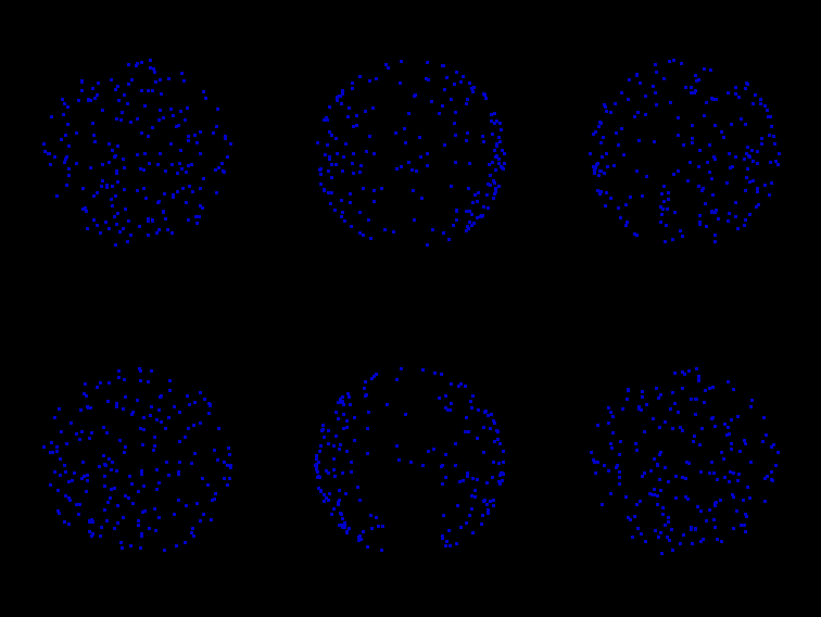
Think you've worked it out? Look at it again. Are you SURE it isn't spinning the other way? Keep trying and you'll see it change direction right in front of your eyes.
It's not the animation doing that. It's just a simple loop of some dots, which always travels in the same direction. Whatever you can see in those dots is all in your head.
Enjoy!
As seen on Mighty Optical Illusions.
Friday, 19 February 2010
Spring Fair 2010 - Part 2: Beef Up Your Walls
The thing I like to do most when I visit Spring and Autumn Fairs is to just wander up and down the aisles and take in an overview of what the season's design trends are. Last autumn was brightened up by huge colourful flowers. The flavour for this season is...
...beef.
It seemed like every other art stall was overflowing with paintings of cows.
Spotty cows...

Brown Cow? by Jennifer Brereton at Collier and Dobson, prints from £105
...hairy cows...

I Spy by Thuline at Alpha 1 Marketing, £99
...cheeky cows...

Friesian Orange by James Bartholomew at The Mill House Gallery, prints from £95
...moody cows.

The Black Angus by Angela Davidson, prints from £50
If cows aren't your pick of the farmyard, there were plenty of other tasty animals to choose from.

Cocktail by Mary Ann Rogers at Alpha 1 Marketing, £66

Grazing Sheep by Timmy Mallett - yes, THAT Timmy Mallett - at Buckingham Fine Art Publishers
Foxes were also popular...

The Fox by Gary Benfield at Buckingham Fine Art Publishers, giclée print £153
...hares even more so.

Brown Hare by Nigel Artingstall, £395

On The Run by Kate Osborne at Artreo, giclée print £82.25
But mostly it was cows.

Cliffs and Cows by Michael Embden at Artreo, giclée print from £70
All images are for illustrative purposes only and link to the site of origin. All copyrights respected.
Sunday, 14 February 2010
Happy "Oh Well It's Only Exploitation By The Card Companies" Day
If you're not familiar with the blog, Adam Lennard the Sleep Talkin' Man is a mild mannered advertising accounts manager by day, a potty-mouthed, vegetarian-hating, badger-loving surrealist in his sleep. Now every night his wife Karen records his ramblings and posts them up the next morning.
I should warn you his site is VERY rude. Please don't visit if you're offended by very strong (albeit hilarious) language.
I'm doing some typography for a mystery project the couple are planning, so here's one of his typically romantic outbursts illustrated for your Valentine's Day pleasure. Click on this image to see the rest of the quote (I've cleaned it up a bit!)

Saturday, 13 February 2010
The World Comes To Vancouver
The 2010 Winter Olympics has kicked off today in Vancouver, Canada. Here's a playlist of some of the best trailers and commercials from various countries. (Total running time approx. 10.5 minutes.)
The Canadians themselves are going heavily for the patriotic approach. As a bilingual country I've also included the compare-and-contrast English and French versions of the official launch video. The Americans like to champion the human achievement angle whereas China (being the last Olympic country) revels in the beauty and spectacle of it all. The British and Germans are going for a more artistic approach. (Apparently the British trailer is also being used on Russian TV.) For Australia, of course, it's the middle of summer. There's a beautiful animation from the Olympic movement itself as well as the official opening titles from Olympic Broadcasting Services Vancover.
Oh and little kids + ice = adorably funny.
Also, the Olympics wouldn't be the Olympics without a cute mascot or 4, with these guys inspired by native Canadian legends.
These are the last Olympics before London 2012 so I wonder what we'll be coming up with? I'm off to scribble down my ideas for Percy the Trafalgar Square Pigeon!
Thursday, 11 February 2010
Spring Fair 2010 - Part 1: New Goodies From You Know Who
It seems like only yesterday I was reporting from Autumn Fair 2009, but yesterday I was back at Birmingham's National Exhibition Centre to see its big sister, Spring Fair International 2010.
For the first week every February, Spring Fair takes up all 20 halls of the NEC to become the UK's most important showcase for the greetings, gift and homeware industries. Exhibitors and buyers from all round the world congregate to do millions of pounds' worth of trade and show off the very best in contemporary design.
Due to its size, it's impossible to go round and see everything in one day, so I just stick to my main areas of interest, which are greetings, art and contemporary gifts. Okay, maybe a few toys...
Over the next few days I'm going to share my pick of the best new products with you. Without a doubt, I've ticked off far more names on my exhibitors' list to follow up than I've ever done before.
For today, though, the blog's about something that I know will get many hearts a-fluttering. The excitement started as soon as I stepped into the piazza, got handed my show guide and saw this bee-you-tiful sight on the back cover...
Wow! Stuff are a Wolverhampton-based company that specialise in scientific toys, gadgets and puzzles themed around great British institutions such as The Science Museum, Mensa, Top Gear and Wallace and Gromit. To tie in with Matt Smith taking over the lead role, they now have a licence for Doctor Who merchandise, which is so new it isn't even mentioned on their website yet!
The new range was debuted at The Toy Fair at Olympia, London, in January, and is expected to hit the shops in October.
The Doctorwhotoys website printed their own excellent description of the range. Of these, I saw:
- Desktop Patrol Dalek: With inbuilt sensors to stop it bumping into things or falling off the edge of the table. A bit of a throwback to the classic Rolykins Dalek from the 1960s that my brother used to torment me with when I was a kid, to the point where our Mum made him get rid of it. Years later they were selling for hundreds of pounds. Serves him right. Sorry, I digress.
- Adipose Stress Toy: Self-explanatory, a squishy Adipose doll.
- Sonic Screwdriver: An accurate replica of the new one that Matt will be using but I'm afraid I wasn't able to get a close enough look to confirm whether it's the gadget version or the rumoured pen.
- Following Cyberman: A Cyberman's head whose eyes have the effect of following you round the room.
- TARDIS Emergency Fund: A small TARDIS on a keyring, that you can keep some folded up money in.
- Also, not on the Doctorwhotoys list, I saw a Spinning TARDIS, which seems to be some sort of magnetic repulsion toy that makes the model TARDIS spin above its base.
I should point out that I only saw them in their boxes, they weren't out on full display or being demonstrated. So I can't totally vouch for the details and there may have been other products there that didn't catch my eye as readily.
No photographs have been issued of these items, but I can tell you they look extremely classy indeed. They nearly all have an unpainted chrome finish and seem very durable.
This will also be the first time we'll get to see the new series' logo being used in packaging and, on this range, it comes across as very sophisticated. The box is in a simple blue, black and white colour scheme with the logo running across the top and a section cut away so you can see the product. There's no picture of Matt on the front.
I imagine these will be aimed squarely at the dads and elder children (that's not to say there aren't plenty of women who'd have fun with them, of course!) If you're lucky you may find an official Wow! Stuff product demonstrator and/or promotional video in your local stockist this autumn.
I'll update you with any information that appears on the Wow! Stuff website. You may also like to read the Drwhofigures verdict on this and the other new Series 5 merchandise promoted at the Olympia Toy Fair.


